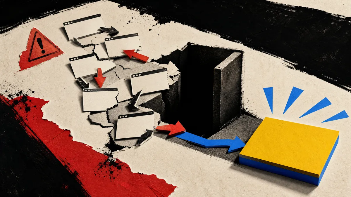
Most website problems do not announce themselves with an error message. The pages still load. The logo is visible. The contact information exists somewhere. Yet potential customers leave because the experience creates too much uncertainty or effort.
If people regularly ask questions your website should answer, struggle to find the right service, or contact you without the information needed to help them, the site may be creating friction. These seven signs show where to look.
1. The opening message could describe anybody.
A headline such as “Quality service you can trust” sounds positive, but it does not explain what the business does, who it helps, or why someone should continue. Visitors should not need to study the navigation or scroll through several screens to understand the offer.
A stronger opening states the service plainly, adds relevant context, and gives the visitor an obvious next step. Clever language can support that message, but it should not replace clarity.
2. Important information is scattered.
Customers should not need to search across several pages, social profiles, old posts, and downloadable documents to understand a basic service. Scattered information creates repetitive questions and makes comparison difficult.
Group related details around the customer’s decision. A service section can explain what is included, who it is for, how the process works, and what action to take next.
3. Mobile feels like a smaller desktop.
A responsive website should do more than squeeze the desktop layout into a narrow screen. Text needs comfortable line lengths. Buttons need enough space to tap. Images need intentional crops. Menus need to be usable with one hand. Forms need labels and fields that do not fight the keyboard.
Open the site on a real phone and complete the action you want a customer to take. If navigation, reading, or submitting the form feels awkward, the mobile experience needs attention.
4. The site is slow to become useful.
Large images, unnecessary scripts, and poorly loaded media can delay the moment when visitors can read or act. A cinematic effect is only valuable when it supports the message and degrades safely. It should not leave the visitor staring at a blank surface.
Prioritize the first screen, optimize media for its display size, and load below-fold content only when it is needed. Performance is part of the design because waiting changes how professional the business feels.
5. Claims appear without proof.
Businesses often use words such as professional, experienced, reliable, or high quality. Customers have heard those words before. The website should support them with appropriate evidence.
Proof can include real project examples, detailed service explanations, a clear process, authentic customer feedback approved for publication, professional affiliations, or complete business information. The right evidence depends on the industry. Invented numbers and exaggerated promises weaken trust rather than strengthening it.
6. Contacting you creates more work.
A generic form with only a name, email, and empty message box may produce vague inquiries. On the other hand, a massive intake questionnaire can discourage someone who is still deciding.
A useful inquiry form collects enough information to understand the request without demanding every project detail. It can ask about the service, rough timeline, budget direction, and a short summary while providing honest options for people who are not sure yet.
7. The next step changes or disappears.
One section says “Learn More.” Another says “Connect.” A third says “Submit.” None clearly explain what happens. Inconsistent calls to action force the visitor to interpret the interface instead of considering the service.
Choose a small number of meaningful actions and use them consistently. “Request an Estimate,” “Book a Consultation,” or “Start Your Project” tells people what they are doing. The surrounding copy should explain what happens after the click.
Test the complete path.
Do not review each page in isolation. Start from the homepage, choose a service, look for proof, open the contact flow, submit it, and confirm the response. Repeat the path on mobile and in more than one browser.
The goal is not to eliminate every possible hesitation. It is to remove avoidable confusion so the right customer can understand the business and act with confidence.
MAKE THE NEXT STEP OBVIOUS.
StacksLV builds and improves small business websites around clear messaging, useful proof, responsive behavior, and structured inquiries.
Start Your Project ↗